
Have you ever stared at a stock market chart, feeling overwhelmed by the lines, bars, and numbers dancing across the screen? If you’re new to investing or even a seasoned trader, understanding stock charts is like learning the alphabet of wealth building. These charts are not just squiggles—they’re powerful tools that reveal how stocks behave, helping you make informed decisions in the Indian stock market. Whether you’re eyeing blue-chip stocks on the NSE or exploring small-cap opportunities, mastering chart types can give you an edge in personal finance and investing.
In this guide, we’ll break down the most common types of charts used in the Indian stock market, explain their significance, and show you how to use them to make smarter investment choices. From foundational knowledge to practical tips, this post will equip you with the skills to read charts like a pro. Let’s dive in!
Understanding Stock Charts – The Foundation
Stock charts are visual representations of a stock’s price movements over time. They’re the heartbeat of the market, showing how prices fluctuate based on supply, demand, and investor sentiment. For Indian investors, whether you’re trading on the BSE or NSE, charts are your window into understanding trends, spotting opportunities, and avoiding costly mistakes.
Why Charts Matter in Investing
Charts help you:
- Track price history: See how a stock like Reliance Industries or TCS has performed over days, months, or years.
- Identify trends: Spot whether a stock is in an uptrend, downtrend, or moving sideways.
- Time your trades: Decide the best moments to buy or sell based on patterns.
- Manage risk: Understand volatility to protect your capital.
Common Timeframes
Charts can display data over various periods:
- Intraday: Tracks price movements within a single trading day (e.g., 1-minute or 1-hour charts).
- Daily: Shows daily price changes, popular for swing traders.
- Weekly/Monthly: Ideal for long-term investors analyzing trends over months or years.
Key Chart Components
Every chart has three core elements:
- Price: The y-axis shows the stock’s price (e.g., ₹2,000 for HDFC Bank).
- Time: The x-axis represents the timeframe (e.g., 1 day, 1 month, or 1 year).
- Volume: Bars at the bottom indicate trading activity, showing how many shares were traded.
Charts are universal, but in India, platforms like Zerodha Kite or Upstox Pro make them accessible with real-time data for stocks like Infosys or SBI. Understanding these basics sets the stage for diving deeper into chart types.
Want to build a strong investment foundation? Check out our guide on stock market basics for beginners.
Types of Stock Charts – In-Depth Analysis
Now that you know why charts matter, let’s explore the main types of stock charts used in the Indian stock market. Each type presents data differently, catering to various trading styles and strategies.
1. Line Chart
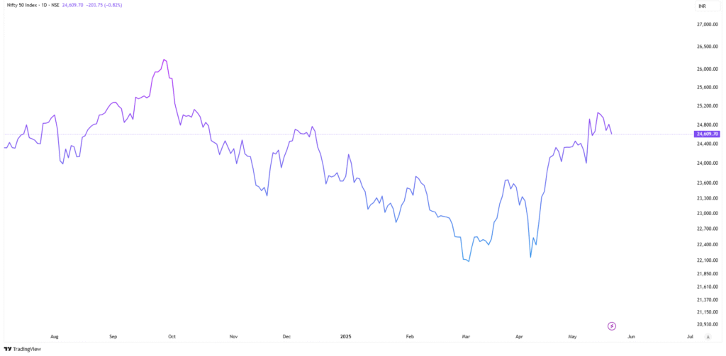
What It Is: A line chart connects closing prices over a period, forming a single, continuous line. It’s the simplest chart, showing the stock’s overall trend.
How It Works: Each point on the line represents the closing price at the end of a trading session (e.g., daily or weekly). For example, a line chart for Tata Motors might show its closing price rising from ₹500 to ₹600 over a month.
Best For: Beginners and long-term investors who want a clear view of price trends without clutter.
Example: Imagine you’re analyzing Bajaj Finance. A line chart shows its price steadily climbing from ₹6,000 to ₹7,000 over six months, signaling a strong uptrend. This simplicity helps you focus on the big picture.
Common Mistake: Relying solely on line charts can miss intraday volatility. For instance, a stock may close at ₹1,000 daily but fluctuate wildly between ₹950 and ₹1,050 during the day.
2. Bar Chart
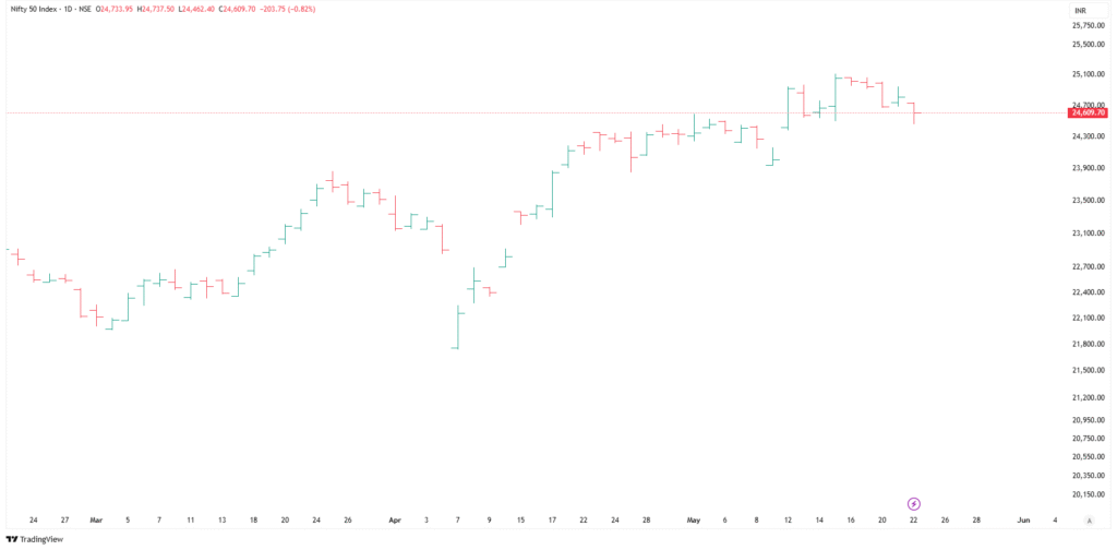
What It Is: A bar chart uses vertical bars to show a stock’s price range for a specific period. Each bar represents the opening, closing, high, and low prices.
How It Works: A single bar for a day might show:
- Top of the bar: The highest price (e.g., ₹1,200 for ICICI Bank).
- Bottom of the bar: The lowest price (e.g., ₹1,150).
- Left tick: Opening price.
- Right tick: Closing price.
Best For: Traders who need more detail than a line chart, such as swing traders analyzing daily price movements.
Example: In 2023, a bar chart for Adani Enterprises revealed high volatility during the Hindenburg controversy, with daily bars showing sharp drops and recoveries. This helped traders spot buying opportunities during dips.
Common Mistake: Overlooking volume. A bar chart showing a price spike without high volume may indicate a weak trend.
3. Candlestick Chart
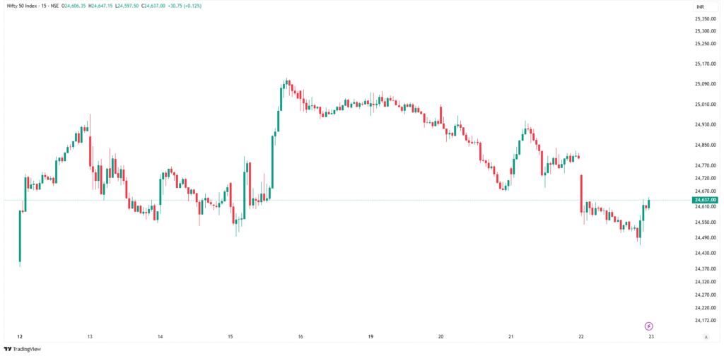
What It Is: The most popular chart in the Indian stock market, candlestick charts use “candles” to represent price action. Each candle shows the open, close, high, and low for a period.
How It Works: A candle has:
- Body: The thick part showing the difference between open and close prices.
- Wicks (Shadows): Thin lines above and below the body, showing the high and low.
- Color: Green (or white) for a closing price higher than the open; red (or black) for a lower close.
Best For: Technical traders looking for patterns like “Doji” or “Hammer” to predict reversals or continuations.
Example: In mid-2024, a candlestick chart for ITC showed a “Bullish Engulfing” pattern after a downtrend, signaling a potential reversal. Traders who acted on this pattern saw gains as ITC’s price rose 10% in two weeks.
Common Mistake: Misinterpreting patterns without context. A single candlestick pattern isn’t enough—always confirm with volume or other indicators.
4. Heikin-Ashi Chart
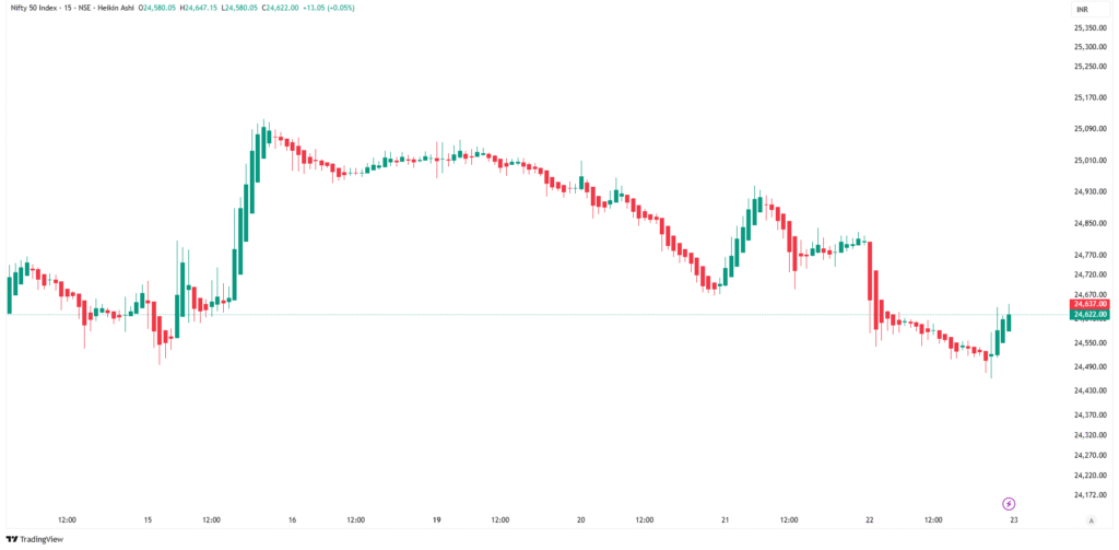
What It Is: A variation of the candlestick chart, Heikin-Ashi smooths price data to highlight trends and reduce noise.
How It Works: It uses modified formulas to calculate candle values, making trends clearer. For example, a series of green Heikin-Ashi candles indicates a strong uptrend.
Best For: Trend-following traders who want to avoid false signals during choppy markets.
Example: During a volatile period for the Nifty 50 in 2024, a Heikin-Ashi chart helped traders stay in an uptrend for Infosys, ignoring minor pullbacks.
Common Mistake: Using Heikin-Ashi for precise entry/exit points, as it lags due to smoothing.
5. Point and Figure Chart
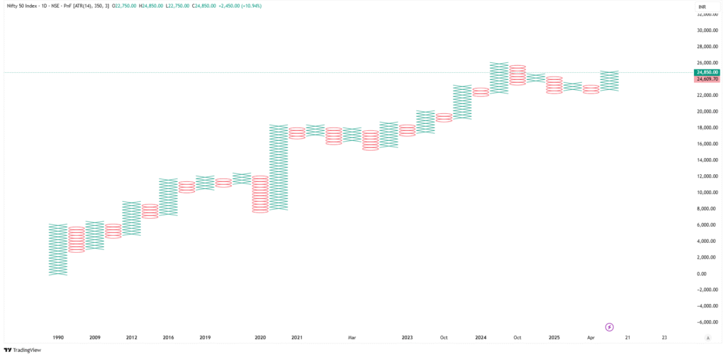
What It Is: A unique chart that ignores time and focuses solely on price movements, using Xs (rising prices) and Os (falling prices).
How It Works: It plots price changes in fixed increments (e.g., ₹10). A new column starts only when the price reverses by a set amount.
Best For: Long-term investors identifying major support and resistance levels.
Example: A point and figure chart for HDFC Bank in 2023 highlighted a strong support level at ₹1,400, helping investors buy during dips.
Common Mistake: Ignoring this chart’s complexity—it’s not beginner-friendly and requires practice.
Curious about technical analysis? Explore our post on using indicators for better trades.
Actionable Tips for Using Stock Charts
Ready to put your chart knowledge to work? Here are five practical tips to help you analyze charts effectively in the Indian stock market:
- Choose the Right Chart for Your Goal: Use line charts for long-term trends, candlestick charts for short-term trading, and point and figure charts for support/resistance levels. For example, a long-term investor might use a weekly line chart for Reliance Industries, while a day trader uses 5-minute candlestick charts.
- Combine Charts with Volume: Always check volume bars at the bottom of charts. A price spike in Maruti Suzuki with low volume may not sustain, while high volume confirms a strong move.
- Use Free Charting Tools: Platforms like TradingView (tradingview.com) or Zerodha Kite offer free, real-time charts for Indian stocks. Customize timeframes and add indicators like RSI or MACD for deeper insights.
- Practice Pattern Recognition: Spend 10 minutes daily analyzing candlestick patterns on stocks like SBI or Tata Steel. Use Investopedia’s candlestick guide (investopedia.com) to learn patterns like “Morning Star” or “Bearish Harami.”
- Backtest Your Strategy: Before trading, test your chart-based strategy on historical data. For instance, check how a candlestick pattern worked for Infosys over the past year using Zerodha’s charting tools.
These tips can help you build confidence and improve your investing decisions over time.
Potential Risks and Considerations
While stock charts are powerful, they come with risks and limitations:
- Over-Reliance on Charts: Charts don’t predict the future. A bullish pattern in Reliance Industries can fail if unexpected news (e.g., a regulatory change) hits the market.
- Market Volatility: The Indian stock market can be volatile, especially during events like Budget announcements. Charts may lag during such periods.
- Learning Curve: Candlestick and point and figure charts require practice to master. Misreading patterns can lead to poor trades.
- Data Overload: Too many indicators or chart types can confuse beginners, leading to analysis paralysis.
How to Mitigate Risks:
- Combine charts with fundamental analysis (e.g., check a company’s P/E ratio or earnings).
- Start with simple charts (line or bar) before diving into complex ones.
- Set stop-loss orders to limit losses if a chart-based prediction fails.
By balancing chart analysis with broader market knowledge, you can reduce risks and make smarter decisions.
Learn how to manage risks better in our guide on portfolio diversification.
Conclusion
Understanding stock charts is a game-changer for anyone navigating the Indian stock market. From the simplicity of line charts to the depth of candlestick patterns, each chart type offers unique insights to help you build wealth through informed investing. By mastering these tools, avoiding common mistakes, and using practical tips, you can take control of your personal finance journey. Whether you’re a beginner eyeing blue-chip stocks or a trader analyzing Nifty 50 trends, charts are your roadmap to success.